8 Tips to Improve Email Deliverability
When it comes to marketing your business, email is one of the most important tools to connecting with your leads and spreading awareness about your...
I know what I am looking for, and would like to chat.
A team of data-driven marketers obsessed with generating revenue for our clients.
Because the proof is in the pudding.
At Campaign Creators we live by three principles: Autonomy, Mastery, Purpose.

Email marketing is a highly subjective matter- you are almost guaranteed to hear different opinions on just about every aspect of it. One of those aspects is the number of visuals your emails should contain. Too many images in an email design can condemn your campaigns straight to the dreaded SPAM folder. At the same time, having no images in your email will almost certainly hurt your conversion rates.
Indeed, if you take a look at some of the best performing email campaigns of 2016, you will notice that most of them are very visual. As marketers, we must learn to tread the line between using too many images in our emails and not enough. Use them in a way that will have a positive effect on your email’s performance, but not so many that they will adversely affect deliverability.
This blog post is part of "Your Definitive Guide to Lead Nurturing" blog series.
Perhaps the closest thing you can find to a golden rule in email marketing is to focus on the message, not the design. Make sure to use images that contribute to the overarching message of the email, not just because it looks good. One of the things you should constantly ask yourself is: “What is the message I’m trying to get across and am I still focusing on it?” Performing this quick mental check can keep your campaigns streamlined and your messaging effective.
Humans are naturally visual beings and can process images up to 10x faster than written text. Images can be a good way to get the following messaging across in just an instant:
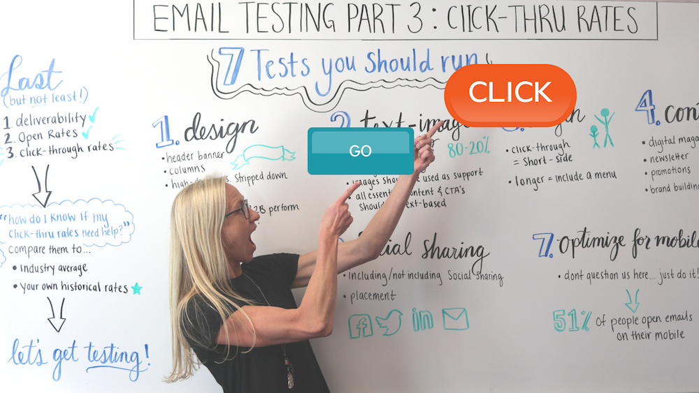
Lots of experts swear by the 30/70 rule when building emails - use 30% imagery to 70% text. Though this is a good starting point, the optimal rate is blurry at best when looking across different industries. Food or travel industry emails might have a higher image-to-text ratio due to the visual nature of the products they are selling. Meanwhile, emails to B2B tech company customers might be text-heavy to describe the complex service offerings they are promoting. As many email filters block out images completely, avoid making emails that have an all-encompassing background image. If this is the case, the first thing these users will see is your “unsubscribe link.” Unless you have too many users in your database and want to get rid of a few, this isn’t exactly the best tactic.
Optimizing the images in your email follows the simple logic, “If you are going to have them, make sure they work for you not against you.” Performing a couple of small tweaks before each send can go a long way towards improving message delivery. A few things you can do to optimize your email images are:
Now that you're on your way to building your email marketing campaign, what about the rest of your lead nurturing strategy? It's time to get our free Next Level Lead Gen guide and start gaining the knowledge you'll need to nurture leads like a pro.

When it comes to marketing your business, email is one of the most important tools to connecting with your leads and spreading awareness about your...

In my last post, I discussed a little about email marketing best practices. Fine tuning your subject lines, providing an even ratio between text and...

Welcome to Part 3 in our series on Email Testing: Click-through rates. In Part 1 of our series, I covered the top 3 things you should be testing and...