The Role of Graphic Designers in Inbound Marketing
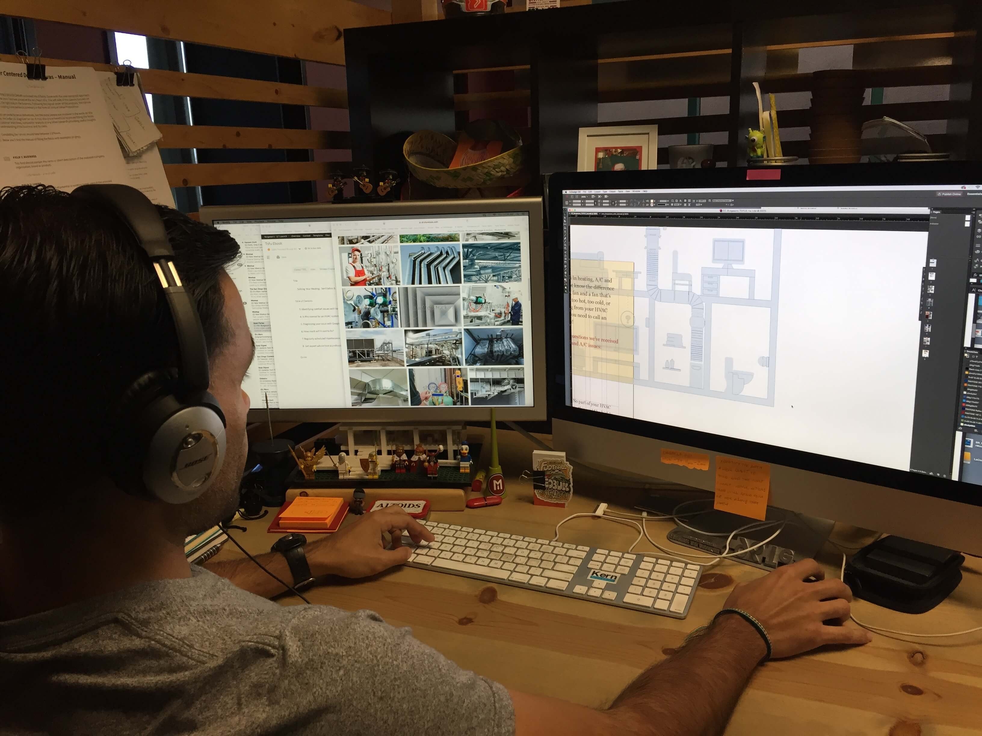
When you think about graphic design, you probably think of Photoshop, logos, or throwing some pictures and words on an ad and calling it a day....
I know what I am looking for, and would like to chat.
A team of data-driven marketers obsessed with generating revenue for our clients.
Because the proof is in the pudding.
At Campaign Creators we live by three principles: Autonomy, Mastery, Purpose.

Interactive PDF's are changing the way users engage with content. In this video Campaign Creators' Interactive Designer, Alvaro Flores, shows us the power of interactive PDF's (ebooks, infographics, guides, etc). Utilizing examples that he made using Indesign CC 2016, Alvaro explains how interactive PDF's can enhance the reading experience through imagery, typography, color, layout and engagement through motion graphics.
What's up, everyone? My name is Alvaro, Interactive Designer here at Campaign Creators. Today, I will be talking to you guys about interactive ebooks, but, first, what is an ebook? An ebook is simply an electronic reading material that is informative with valuable content that speaks to the targeted demographics. Now, an ebook is just not throwing content on a couple of pages and call it a day. We take the fundamentals, theory, and philosophy of design and apply it to our ebooks. Design can not only be appealing or make things look pretty, but, most importantly, it enhances the reading experience through imagery, typography, color, and layout. With that being said, sit tight while I catch my screen to give you guys a quick demo on these interactive ebooks.
All right, guys, and we are back. Let's get right to it. So, I was talking to you guys about ebooks and how design can really enhance the user's reading experience. What if you can take that a step further and add interactivity, in other words, animation, to really get your users engaged with your content? I've put together a couple of examples. Let me just open up my window here and I'll show you what I'm talking about. The first one, static cover page, and, again, you can animate any of the stuff in here. Next one, you have your table of contents. You can also animate the type in here, animate these graphics in the background. The first one, you'll see that the type, your H1 and your H2, just kind of come in from the left and the right to really set up some type of hierarchy and to make it more lively, to give the page some life, in other words.
Moving along, this is one of our section dividers. Again, you see how the chapter three kind of just flowing up to the top. Next page, notice that the headline on top does, like, this spring action, the image pulsates, showing that that's an important image or something. In other words, just to keep the reader engaged by having things move around the page. In other words, so that way it's not just static. Next page, again, we have an image that fades into place. When you get to what we call our CTA page, you have that icon just kind of coming down the path and to really focus more on the call to action, which is the download now button, and it's clickable. You can click here and it'll send you to download the asset.
On this next example, you're going to see that this cover page is a little bit more animated than the previous one. Let me refresh this page and I'll show you what that animation looks like. Here you have your main headline that fades in, sub-headline fades in, and then you have these dots here that just kind of pulsate. I'll refresh again. Main headline fades in, sub-headline fades, and then the dots pulsate. Moving on to the next page, you'll see that there's a headline that fades in, copy comes in, body copy comes in, and then you have, these are little assets, such as this icon that start here, and then the footer. Then you'll also notice that there's an arrow here that kind of just pulsates indicating that this item here, this icon, is actionable.
Let me refresh the page again so that way you can see the animation before I show you what this does. Click back, back again. Headline comes in, copy, body copy, icon, start here, and the footer, and then here's the arrow again pulsating, indicating that this is an actionable icon. If we were to click on that, you'll notice that this panel just kind of opens up and this is just dummy text, but it can be any type, you can put an image here or anything that you want to put here for your users to see. Then we can close this. I'll open it again and close it.
Why should someone care about interactive ebooks? As I mentioned earlier in this vlog, interactive ebooks not only add flair or pizazz, but, most importantly, it enhances the reading experience through imagery, typography, color, layout, and engagement through motion graphics. Thanks for watching, and don't forget to visit campaigncreators.com and download our free guides and ebooks and be on the lookout for our next full interactive ebook. Until next time...
Let us know what you think of Alvaro's interactive designs? Comment below to let him know.
Looking for additional ways to take your content marketing to the next level? Turn it into a lead generation campaign with your free comprehensive Introduction to Lead Generation guide.

When you think about graphic design, you probably think of Photoshop, logos, or throwing some pictures and words on an ad and calling it a day....

When it comes to marketing your business, email is one of the most important tools to connecting with your leads and spreading awareness about your...

Our market researcher, Tammy Duggan-Herd, attended the 3-day B2B Marketing Exchange Conference in Scottsdale, Arizona! So we thought we’d put...