Best Practices to Hook Customers with Your Call-to-Action (CTA)
No conversion rate optimization strategy is complete without an element we can often take for granted: the call-to-action. The stats on the effects...
I know what I am looking for, and would like to chat.
A team of data-driven marketers obsessed with generating revenue for our clients.
Because the proof is in the pudding.
At Campaign Creators we live by three principles: Autonomy, Mastery, Purpose.

This post is a segment of a two-part series on call-to-actions.
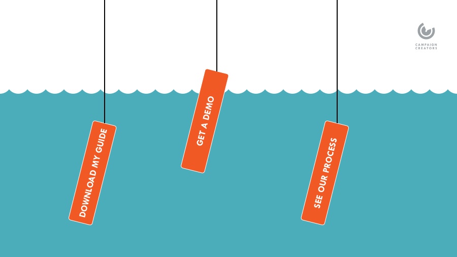
Marketing and design departments all over the world seem to repeatedly clash on how to grab a customer’s attention. However, experts from both sides agree on what comprises a successful call-to-action (CTA). A CTA is an offer for users to take a certain action you suggest. Often they come bearing the words, “sign-up” or “download” to indicate to the viewer that a interactive decision is available. A good CTA uses simple design and concise text to persuade the customer either to take a further action within the channel or receive a reward for providing personal information to the system.
In order to help our readers, we’ve compiled a list of basic suggestions for creating call-to-actions. Here are the first 3 tips in our series meant to help you get the most out of your CTA's.
Unless you cushion your main action button with some motivating text, your CTA will seem like any another web site directional button. Start by grabbing the viewer’s attention with a large header that immediately tells them the main benefit they’ll get from interacting with the CTA. Headers that point to saving or producing money often work best. You should then go on to list detailed aspects of what will happen if the viewer takes the action you’ve set out for them. Bulleted lists often work well for this area and allow you to highlight the main benefits the viewer will receive. Details should be short and simple so that the viewer does not become overwhelmed or bored from too much information.
Clear action verbs placed within the CTA text and over the main action button will better direct your viewer. They will quickly understand the value of accepting the offer, allowing for a decreased consideration time and potential loss of interest. Words such as “Sign-up”, “Receive”, or “Get” all convey the message that the offer will do something for the viewer, which will motivate them to enter their information, if necessary.
To find out more about improving CTA conversion rates on your blog, check out this articlefrom our Inbound Hack series.
Although data collection is important to marketing efforts, viewers can easily be discouraged from taking action if your personal information fields are too detailed. Sometimes asking for only 3-4 fields rather than 5-6 can be the difference between a customer following through your process or dropping off halfway. Viewers can often become discouraged by CTA’s asking for a business phone in addition to a cell phone number, or requests for entire corporate addresses. CTA’s should be easy to complete and present minimal hurdles to the audience. Customer attention spans are short, and you want your CTA’s to draw viewers further into your company, not push them away.
We hope this post has given you an overview of the basics on how to build the most effective CTA possible for your digital channels. We encourage you to stay tuned for part two of the call-to-action series, where we’ll outline the best design practices for CTA’s.
Apply your new CTA knowledge to an Inbound Marketing Campaign. Our free guide Introduction to Lead Gen (including Campaign Checklist) will get you started.
This blog post is part of “Your Definitive Guide to Lead Generation” blog series.

No conversion rate optimization strategy is complete without an element we can often take for granted: the call-to-action. The stats on the effects...

With the turn of the year, many people tend to take on new initiatives to meet their marketing objectives. I would say one of the more popular...

When you think about graphic design, you probably think of Photoshop, logos, or throwing some pictures and words on an ad and calling it a day....